Globaleur Personalized Travel Itinerary
Providing new layout and flows of personalized travel itineraries
What is ‘Globaleur’?
Globaleur is a customized travel planning service that uses AI solutions and machine learning to collect traveler’s trip styles or preferences and provide personalized travel itineraries. Mainly, Globaleur’s service directly focused on personal planning, but also, travelers can discover other related services like hotel, flight, and tour bookings through this platform. This service enables users to plan and book trips and socialize together.
Working closely with front-end engineers and product managers, I completed Globaleur’s UX/UI Design for Ver0.2 & 0.3 for the Android mobile platform.
Role
As a UX&UI Designer, I updated the planning flow and recommendation feature based on Globaleur users' feedback.
Team
Working with a product manager, a backend engineer, and an Android developer
Timeline
April 2019 - August 2019
Methods
User Testing, Iterate Wireframes, UI Design with visual system, Rapid Prototype
Tools
Adobe XD, Adobe Illustrator, Adobe AfterEffects
1.0 Project Summary
1.1 Target Audience
1.2 Problem Statement
After launching the Android mobile application, the design team test our product with potential users and found pain points while tracking users’ behaviors.
1.3 Design Process
After launching the Android Ver 0.3 mobile app, the design team test our product with the potential users to get feedback and track users’ behavior.
The design team had a big mission to rebuild the planning process and find the pain points to improve users' access from the users' feedback. Usually, the companies that dive into the travel industry have tons of content, so the service must provide the data more accessible, accurate, and useful. During this sprint, my role was to restructure the planning flows and update planning pages' layouts to make users use it efficiently.
2.0 Pain point of the previous version (based on the user testing results)
2.1 Overview of previous experience
2.2 Detail pain points
3.0 Solution Process
3.1 Goals
Planning page layout and flow need updates on the entire planning process.
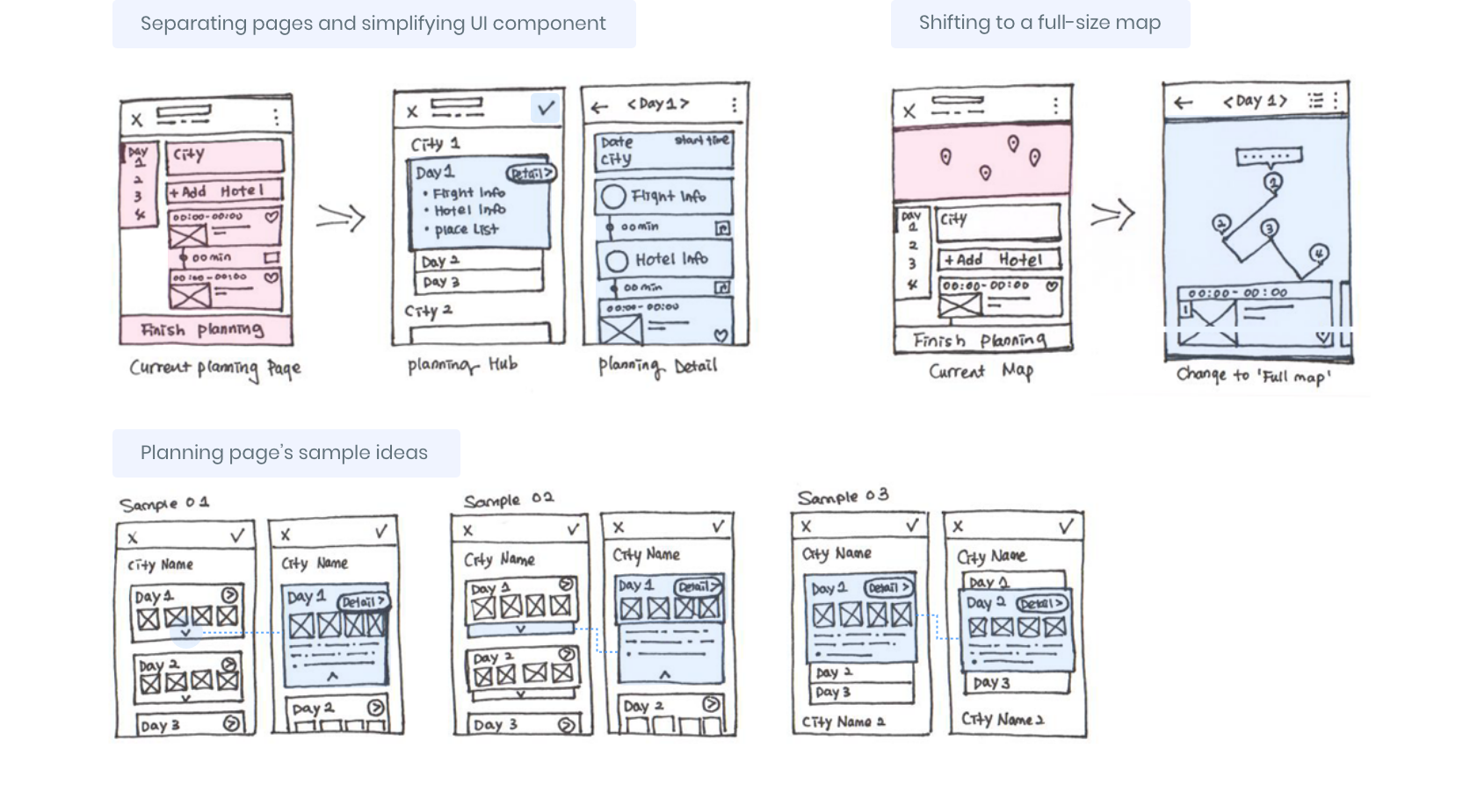
Most of the users finish their plans after they get trip recommendation plans. The main reasons are that the users end the trip plan before exploring other features. And the ‘finish’ button is too highlighted. And it inadvertently forced users to finish their planning process. In addition, the planning page was too crowded/complicated to find out other functions. And for the map view, map size was too small to check the location, making it useless. All these pain points were from the full layout page, so the design team separated the pages for their respective purposes.
3.2 Page layout ideation
3.3 Detail solution process
3.4 Overview of updated task flow
4.0 Concept Generation
4.1 Whiteboard kick-off and research
The primary purpose of this project is making users browse all our planning features and functions more clearly. So our team decides to spread out the essential functions of the planning page to other separated pages.
Primarily, we decided to pull out the itinerary planning page and divided pages to the planning hub page and detail page. Moreover, emphasizing recommended places or trips, which is our identifying feature.
4.2 Wireframe&Iteration
4.3 UI design iteration example
Plan itinerary page iterations
Detail route page iterations
5.0 Final Design
6.0 Conclusion
Throughout this ‘planning page update project,’ we recognized that the current flow did not go as well as how our team pictured it.
After the user testing with the updated design, we find it out that the users were satisfied with our service more than before. For most travel planning and booking platforms, it is easy for users to get confused among the excess content and functions, so Globaleur is continuously working to incorporate user experience feedback and organize the flow clearly when we need a big update.
What’s NEXT?
After the updates, we will get more feedback from users to finalize the planning flow and layout and track the users’ behavior by using the Touch Heat maps. Moreover, for the next project, we will explore ideas to share user trip details through Globaleur with other people on either social media or the Globaleur community page.


